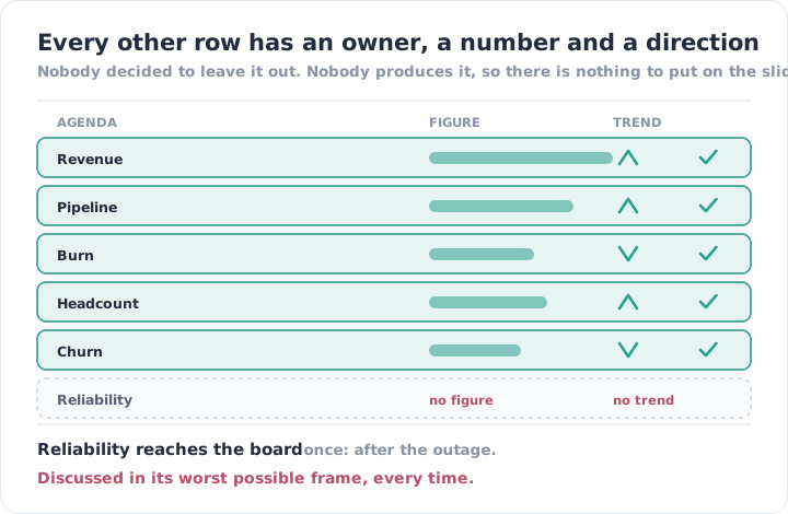
Open the last four board decks. There is revenue, and its trend. Pipeline, and its trend. Burn, runway, headcount, churn, NPS — each with a number, a comparison against last month, and a person who owns it.
There is nothing about whether the product stayed up.
Not because the board decided reliability was unimportant. Because no one produces the number, so there is nothing to put on a slide, so it is not on the agenda, so nobody asks for it. The absence is self-sustaining and completely undramatic.
What it guarantees is that reliability enters the conversation exactly once: after an outage. Which means the subject is only ever discussed in its worst frame — reactively, defensively, with a customer email on the screen and somebody explaining what went wrong. Decisions made in that room are made under duress. They are usually generous, and they are usually reversed within a quarter, because nothing keeps the topic alive between incidents.
Reliability is a product feature argues that it deserves the same standing as anything else you build. This is the mechanical reason it does not get it: features have a number that reaches leadership every month, and reliability has an anecdote that reaches them twice a year.
Why the Artefact Doesn’t Exist
The data is per-tool and does not add up. Uptime for one service from one provider’s console, availability for another from a different one, incident history in a chat thread. None of it shares a definition, so there is no honest way to combine it into a single figure. Anyone who has tried has discovered that the estate produces several numbers and no total — the same arithmetic problem as monitoring that stops at one cloud.
Nobody has agreed what to measure. Uptime of what — the marketing site, the API, the checkout path? Measured from where, inside or outside? Does planned maintenance count? Does a partial failure affecting eight per cent of users count, and as what fraction of an hour? Every one of those is a legitimate question with no default answer, and the conversation to settle them has never been scheduled.
Producing it by hand costs a day a month. Which is not much, and is also exactly the kind of recurring cost that never gets approved because it has no urgent trigger. It is easy to skip in a busy month, and once it is skipped once, the trend line it existed to produce is broken anyway.
And engineering is quietly reluctant. A reliability number is a number that can be used against the team, particularly if the definitions were never agreed and particularly if the first month it is published happens to be a bad one. That hesitancy is rational and it is rarely stated out loud, which makes it hard to resolve.
What Turns Up When You Actually Look
Ask a team for last quarter’s reliability figures and the conversation follows a predictable route.
- There is no incident record. Incidents happened, were handled well, and live in chat threads. Nobody can say how many there were, so the most basic question — is this getting better or worse — has no answer at any level of precision.
- The uptime figure comes from the monitoring tool’s own view of itself. It reports the availability of the checks that were configured, which is a statement about the monitoring rather than about the product, and it is almost always flattering.
- No severity taxonomy. Without one, an incident count is meaningless: a brief degradation and a four-hour outage both increment the same integer, so the number cannot be compared to anything, including itself last quarter.
- MTTR quoted with no definition behind it. From when — the first symptom, the first alert, or the first person acknowledging? To when — mitigated, or fully resolved? Those are four different numbers, and reporting one of them as though it were the whole thing produces a figure that cannot be acted on.
- A snapshot instead of a trend. Where a number does exist, it is this month’s. One data point is not information about direction, and direction is the only thing a board can actually act on.
- Nothing connecting reliability to money. Cost is reported by finance, incidents by engineering, churn by the commercial team, and no artefact puts them on the same page — so the argument for investment is always made on principle rather than on evidence.
- No record of what was done about it. Even where incidents are logged, the follow-up actions are not tracked to completion, so the same cause recurs and there is no document that shows it recurring. This is where blameless postmortems stop short: the writing-up happens and the aggregate never gets assembled.
The pattern is that everything needed exists and nothing is assembled. The alerts fired, the incidents were handled, the fixes shipped. What was never produced is the one page that turns all of that into a direction of travel.
One Page, Same Definitions, Every Month
The instinct is to build something sophisticated. The opposite is correct: consistency is worth far more than depth, because the entire value is in the comparison to last month.
Agree the definitions once, in writing. Which services are customer-facing and therefore in scope. Measured externally, from where customers are. Whether maintenance windows are excluded. How partial failures are counted. Three severity levels, defined by customer impact rather than by cause. This conversation takes an afternoon and it is the whole project — everything after it is arithmetic.
Report the same six things every month. Availability per customer-facing service. Incident count by severity. Time to detect and time to resolve, each with the definition printed next to it. What changed in the estate. What is planned. And the exceptions — the things known to be unprotected and not yet fixed.
Include the ugly month. A report that only appears when the numbers are good is a marketing document and everyone senior can tell. The credibility of the artefact comes entirely from it being unchanged in a bad month.
Put cost on the same page. Infrastructure spend next to reliability outcomes is the only view that makes the trade-off legible, and it is the view that converts a reliability conversation into a business one. It is also the honest answer to the $700K infrastructure illusion — the spend was always visible; what it purchased never was.
Write the second half in sentences. The numbers say what happened. A short paragraph on what it means and what is being done about it is the part leadership actually reads, and the part no dashboard can generate.
| No report | A monthly page | |
|---|---|---|
| Reliability reaches leadership | Via an outage | On a schedule |
| The number is | Absent, or the tool’s own | Externally measured, per service |
| Incidents are | Chat threads | Counted, by severity |
| MTTR is | Undefined | Defined next to the figure |
| The view is | A snapshot after the fact | A trend |
| Investment is argued | On principle, post-incident | On evidence, on a cadence |
| Cost sits | In a different report | On the same page |
The Part a Tool Can’t Do
Producing the figures is automatable. External checks give availability per service. An incident tool gives counts and durations. A cost explorer gives spend. Assembling them on a page is a scheduled job.
Agreeing what they mean is not, and it is the entire difficulty. Deciding that a partial failure affecting a subset of customers counts as a full outage for reporting purposes is a policy decision with commercial consequences, and it has to be made by people who can be held to it. So does deciding which services are in scope — a question that quietly determines whether the number flatters you.
Somebody also has to stand behind the figure in a room. That means owning it when it is bad, resisting the pressure to redefine the metric after a poor month, and being able to explain what moved and why. No tool can do that, and a report nobody owns is a slide that gets skipped.
And the last half — this is what it means, this is what we are doing, this is what we need — is a judgement about priorities. It is the same scarce input as everywhere else in this series: the data was never the constraint.
IOanyT Innovations has been running client infrastructure for over ten years, across more than 150 engagements. The clients who invest in reliability before an incident are, almost without exception, the ones who receive a number about it every month. Not because the number is persuasive. Because it keeps the subject on the agenda between the events that would otherwise be the only time it appears.
Vigil produces that page: availability measured externally per customer-facing service, incidents counted against a severity scale agreed with you, detection and resolution times with their definitions attached, spend alongside outcomes, and a written summary from the team that carried the on-call — including the months we would rather not send.
Your board gets a trend line instead of an anecdote.